Having a few problems with UDK and it is getting to the point where i may just keep it in maya as i am able to control the lighting in there much better and i understand it a lot more with a game engine, its a bit different there are so many things i just dont understand at the moment! I am hoping some people on a forum will be able to help me out!
Friday, 24 December 2010
Tuesday, 21 December 2010
UDK and texturing
UDK first real time of using this and it is going slowly, UDK is a game engine so you can see what your work will look like if it was in a game so everything is in realtime. The project will take longer than i thought due to the fact that i am learning udk as i go. If it fails after many attempts i have the back up of using maya but dont wont to have to.
I have started to import my objects in something that is taking a while to grasp, as you need to do it in a certain way to use features of udks lighting system.
So, i am also starting to texture bits and bobs as i am getting confused by it all, so here is the water tank that sits on top of one of the buildings. Nice and dirty, yum!
Thursday, 16 December 2010
Colourboard and unwrapping
Well, the colour board is on its way....
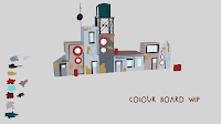
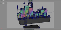
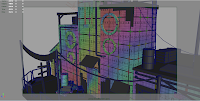

Yep today, i have been able to do a bit of work. Had to do a bit of xmas shopping and all that, but with that out the way now it is all systems go with this one. Whilst, looking/scouting for jobs which i enjoy doing, but its finding the right companies, i look at other peoples showreels who work at these places and who i admire, but man they raise the bar every time. But, i am sure something will come a long soon, i have faith in that!
My last bit of work That's Life will be in 3d artist magazine, issue 24 so hopefully that will do me some good!
But, whilst doing the colour board i have also been unwrapping the objects and here are those images i have been promising, basically i dont want those boxes or numbers to be stretched and it is going well so far.


Wednesday, 15 December 2010
Those wireframes were bad...
So, i decided to do a nice render of it instead not much has changed in terms of looks, but i have started to unwrap the objects and play around with some basic texturing.
I think i have said it before but unwrapping uv's is almost as painful as wrapping up a present even though they sound completly different! I normally use automatic unwrap in maya to understand what the different shells should look like, i then tweak, move, scale and rotate until i am happy with what i see. I also use a image that has boxes and numbers all over it so i can see if my uvs are stretched or not, why use this image? well if the image looks stretched my textures that will look awesome in photoshop will look crummy on my model, boo!
On the forum i am a member of (Polycount) i have put this work on their and they feel that extra objects like bouys, fishing rods and ropes etc will benefit.
But images are easier to show and my next update will go more into unwrapping uvs, for now an image of Harbour Town!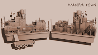

Harbour Town
Well, the last piece wasnt really grabbing my attention and i wasn't excited about working on it, so i have gone back to an art test by splash damage they give you a concept of a lil harbour sort of scene and ask you to model it, texture it etc.
Wednesday, 8 December 2010
Fruit Stand
Here are a few screenshots of the next piece of work my be, its for the Eat3d next gen scene competition, i am a bit behind due to the work i had been doing, i am now looking for work but in the meantime i will carry on working on my portfolio!
So here they are one is the sort of layout i will go for the other are close ups of the low poly and the high poly which i will transfer through the use of normal maps!
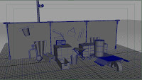
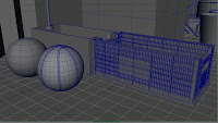
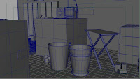
So here they are one is the sort of layout i will go for the other are close ups of the low poly and the high poly which i will transfer through the use of normal maps!


Monday, 6 December 2010
Final
Well here it is, i feel it is now finished, will try to render out a video will only be 10 seconds or so as it takes a while to render out each frame.
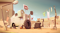
I have learnt a lot on this project on all aspects of the production pipeline and have found new ways to improve my work flow. I want to say thank you to Isaac for allowing me to use his concept, if i could i would create all his stuff in 3d he is such a great illustrator with some lovely work.
There are some bits and bobs i would like to improve upon, but i feel this happens in all work i look back at some of my old work and think to myself what was i doing.
But i hope you enjoy this piece and i have started my next bit of work which will hopefully not take as long as this one now that my contract as ended at my work place!
Here is a link to his blog if you want to check it out:


Thursday, 2 December 2010
Carbonmade
Hey all, you may not know but carbonmade is a free website host for portfolios mine is on ther at the moment not fully updated but has some extra work that isnt on here!
www.simonharvey.carbonmade.com
www.simonharvey.carbonmade.com
95% done
Here is the latest and it is so close i feel, i just want to add some detail to some of the textures like the, shoes for example and the big tyre as i feel that tyre is standing out way to much!
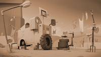
As for the final image i will have two one with all the bits and bobs exerywhere and the second like the original image, with just the caravan etc, so no road, canyons or even a floor it will just be grey around, may also do a brown pass like my first render.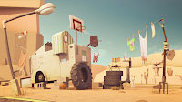

Sunday, 21 November 2010
telescope
This was the model sheet i send in for the competition whilst i didnt win i learnt a lot about using 3ds max especially in baking texture maps and to model efficiently. Prefer maya though :P probably becaus e that is what i learnt at college, but 3ds max does have some nice touches to it.
Wednesday, 17 November 2010
Inspiration for new piece
Latest on the telecope
Ok, the idea is that the telescope has to be 8000 tris, which is quite a few but when your high poly is 350,000 its a bit of a task to do!
Tuesday, 16 November 2010
Latest on the project
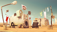
Well, everything apart from the canyons in the background has been unwrapped, so this week i will finish of the texturing. Alot of people on forums have suggested moving things around as they felt everything was in one long line, which it was, so i decided to see what it was like to place the objects in different places.
Another thing was that everything looked 'new' so i tried to add some fading of colours and wear and tear, the clothes also looked flat and cardboard like so i put some gravity and wind in to the scene and did a simulation until i was happy with the outcome.
Wednesday, 10 November 2010
Tron and telescope competition!
These are for two projects that have been going on the Tron one is for Polycount however, i was not able to finish it due to work commitments, however i do aim to finish the telescope one off and send that in! But yeah both have various specs to stick to, which i enjoy as it makes you more creative with what you got!
Friday, 5 November 2010
new image and texturing
Wednesday, 27 October 2010
Monday, 11 October 2010
Little update
Been playing with the colours in this piece, trying to make it a bit warmer and a bit more intresting. I am happier with how it is looking now as before it felt a bit bland in my opinion, havent had much time to work onit but i have unwrapped a few bits and bobs ready to be textured which should be good!
Monday, 4 October 2010
Lil update not much...
Well a got a bit done over the weekend, which i am fairly happy with i have done a bit more since this but didnt render it. I am starting to work on the satelite dish and i am taking refrence frim the incredibles and monsters vs aliens robots from that as visually that is what i want from it. I also went back to a few textures like the spade and fork and played around with the spec and bump. But yeah stil a long way to go not feeling the shorts right now i changed them to boxer shorts but may change the colours, but it is all still in the testing stage.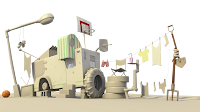

Wednesday, 29 September 2010
Decision
Ok, well here is the update yesterday was my birthday, whooo. At the mature age of 23, great age! But yeah i decided to redo some of the layout change a few bits and bobs to see what looks better. I dont want to say my prefrence as it may influence so if you prefer one let me know! I think the one on the left was the orignal and the one on the right is the one with tweaks. Oh and the textures are all wrong at the mo but that will change :)
Tuesday, 28 September 2010
Polished Off
Well, as i just graduated here is the film me and my friends made;
http://www.vimeo.com/13932472
It is currently in a few competitions like Haff, Encounters and so hope you enjoy!
http://www.vimeo.com/13932472
It is currently in a few competitions like Haff, Encounters and so hope you enjoy!
Monday, 27 September 2010
update
Looking back at the original concept i have lost some of the angles that does create some of the charm of the piece. So over the next few days i am going to layout this a piece again and redo some of the modelling. Its only when someone starts criting your work that you understand where you have gone wrong, so if anyone else sees anything that could do with changing please let me know!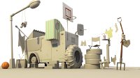

Thursday, 23 September 2010
Not much but its a start
Just playing around with a bit of the texturing for this piece i am currently working on the caravan/home at the moment my main refrence is fillmore from Cars the hippy one on Route 66, thinking of a white paint with some stains/dirt on it. Also want to try and make the metal a bit more shiny, but i am testing different shaders at the moment, which for some reason arent the best for bump maps want a bit more kick in the basketball board!
Monday, 13 September 2010
Family Holiday
This is a new piece i am currently working on, the concept came from an illustrator called Isaac Orloff the link below is to his blog, so go check out his blog there is some gamazing stuff on there :) http://www.orloffillustration.blogspot.com/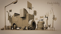

Thursday, 2 September 2010
Saturday, 7 August 2010
sunlounger and texture maps
Well below is a sunlounger that i textured for a competition on Game Artist Forums, pretty happy with it and tried to keep it diverse and original as there were a lot of entries for this one. It didnt win however i am very happy with what i achieved in the time limit i had.
Wednesday, 4 August 2010
Weapon Crate
Subscribe to:
Comments (Atom)


